Kohl's
Redesign of Product Listing Page
No 1The Task
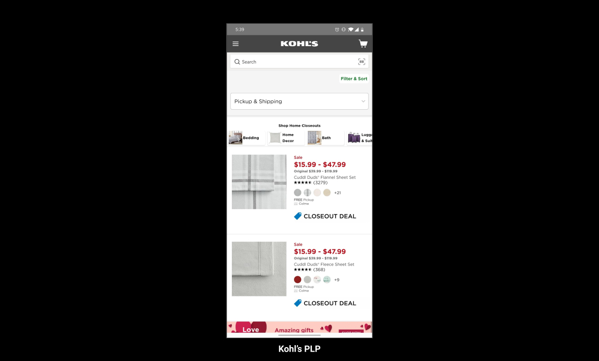
Redesign Kohl’s PLP to bring more value to the user considering UX UI best practices. Constraints: Design within viewport, Explain thought process, 2-3 hours max.
No 2Role
UI/UX Designer
No 3The Process
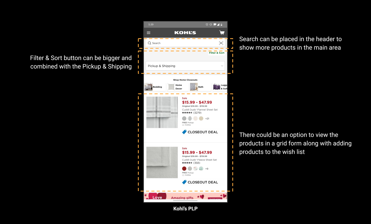
Analyze the screen as a user and as a designer on how to bring more value to the user. Reference similar apps and brainstorm with an online shopper for research and testing.
No 4References
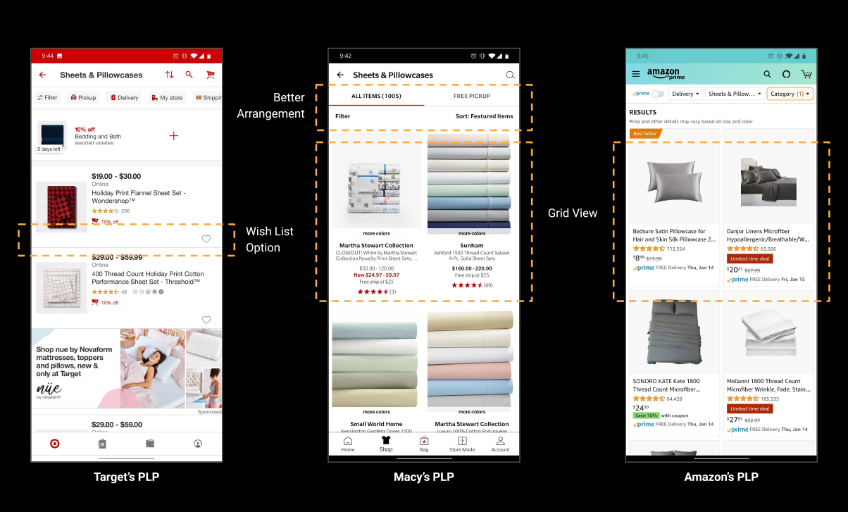
I started with the main competitors like Target and Macy’s while taking the biggest online e-commerce competitor into consideration i.e. Amazon.
No 5Brainstorming
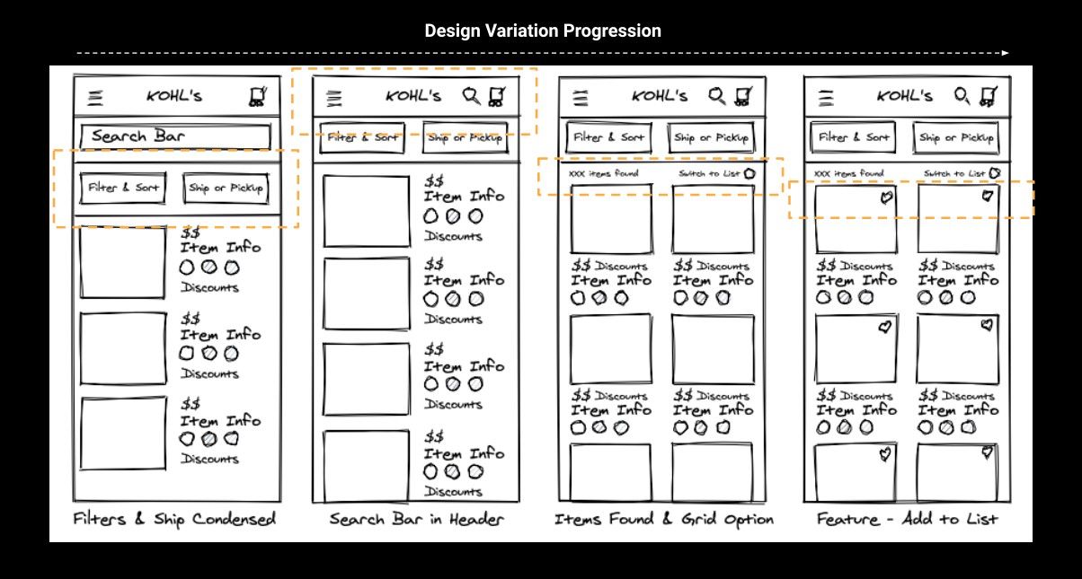
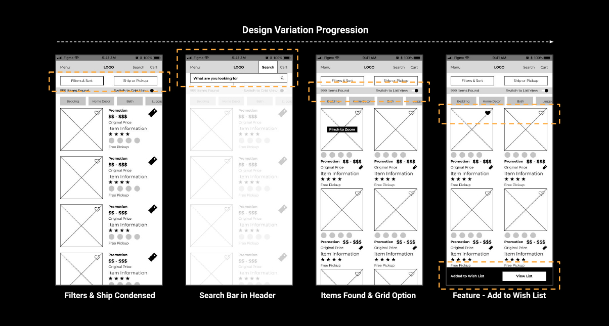
I started sketching out some concepts keeping myself in the shoes of a user as well as a designer to bring the most value to the user in this screen.
No 6Wireframes
I quickly turned the sketches to wireframes to test it out with an avid online shopper to get feedback on the features I added to the page.
No 7User Testing
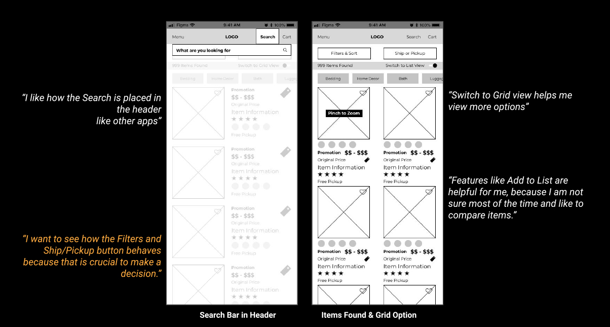
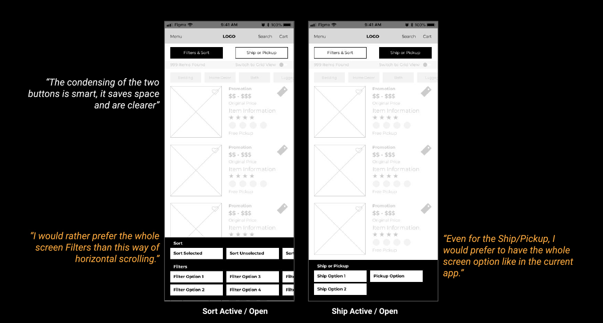
I asked a shopper friend of mine to use this screen in comparison to the Target and Macy’s PLP and give me feedback on features.
No 8Mockups
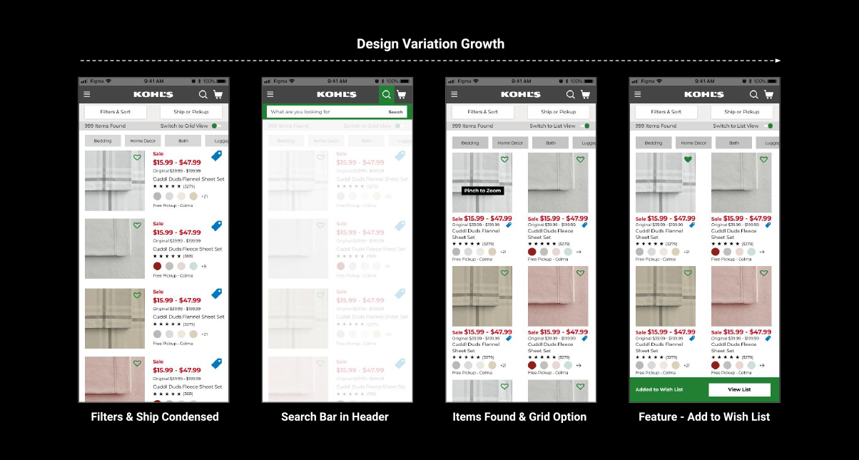
I applied the user feedback and created the mockups to have a final design using the Kohl’s original colors.
No 9User Testing #2
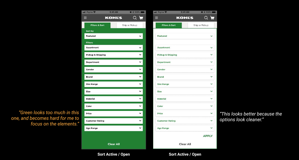
I ran another quick test with the same user after making changes, with two variations of adding colors for their feedback on it.
No 10Final Prototype
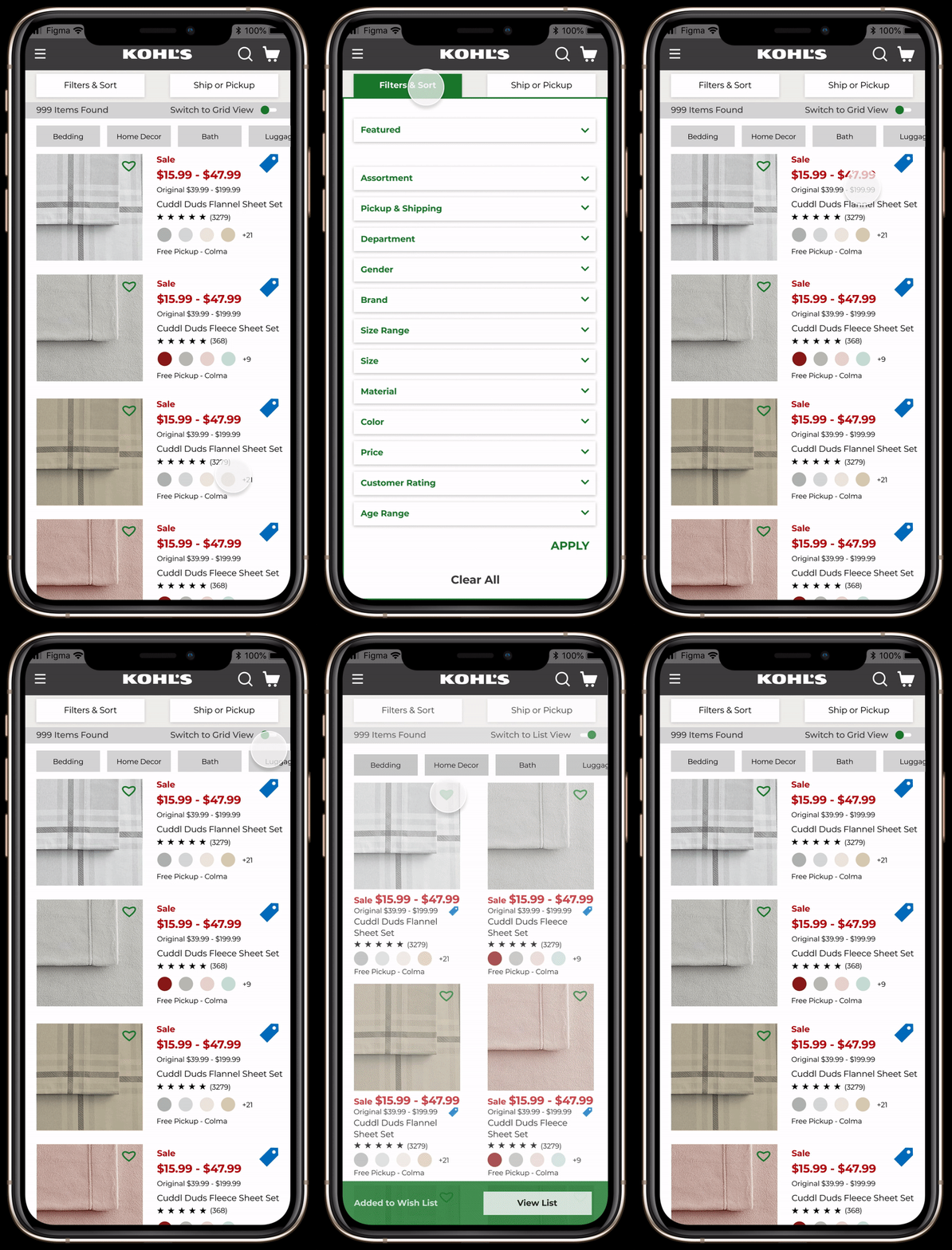
I made the final prototype with all the value-adding features and user feedback along with adding some interactions for a better experience.
No 11Learnings
I learned that the challenge of bringing the most value to the user can be resolved by testing the progress with the users at all major steps in the process.