Sunrun—Internal Monitoring Platform
Redesigning an internal monitoring platform for faster diagnosis and clearer energy insights
No 1Project TL;DR
Modernizing Fleet Monitoring for the Next Generation of Energy
Sunrun’s internal monitoring platform is the nerve center for diagnosing issues across 100k+ solar installations. I was brought in to lead the UX transition during a critical Java-to-React migration, transforming a legacy tool into a modern diagnostic platform that could support Sunrun’s expansion from solar into home battery storage.
Key Focus Areas:
• Technical Migration: Designing a flexible UI for the React framework.
• Data Density: Optimizing time-series visualizations for faster anomaly detection.
• Product Evolution: Introducing complex battery health metrics into a solar-first interface.
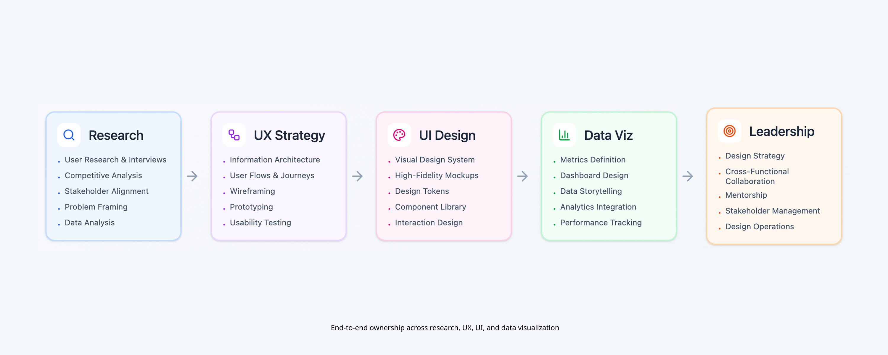
No 2Role & Scope
I worked as the Product UI/UX Designer, partnering closely with Product Directors, Monitoring Analysts, and engineers to redesign the platform end-to-end.
Responsibilities
• User interviews and workflow understanding
• Information architecture and interaction design
• Data visualization concepts and hierarchy
• Design support through engineering handoff
No 3Users & Context
The primary users were Monitoring Analysts responsible for diagnosing issues across thousands of live solar systems. Their work required quickly identifying anomalies in large volumes of time-based data—often under time pressure.
User needs
• Fast access to high-priority system data
• Clear visual patterns for anomaly detection
• Reduced noise during diagnosis workflows
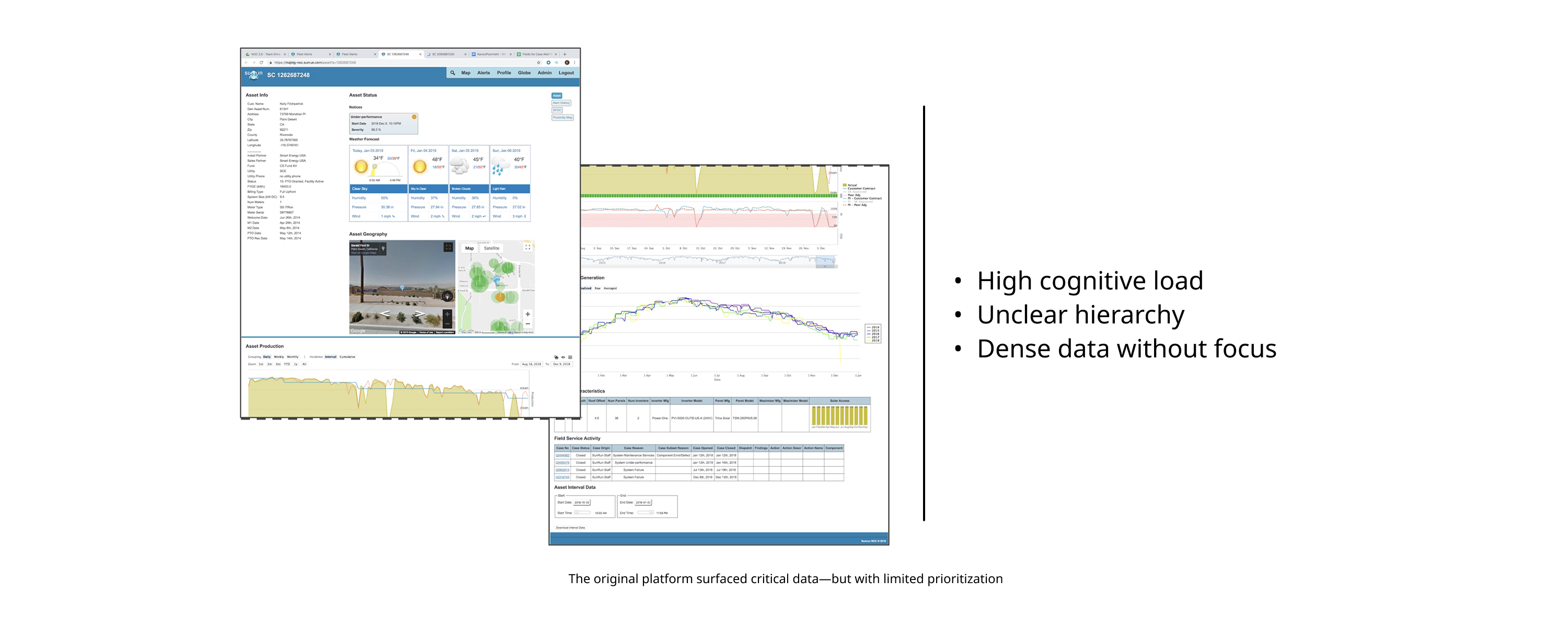
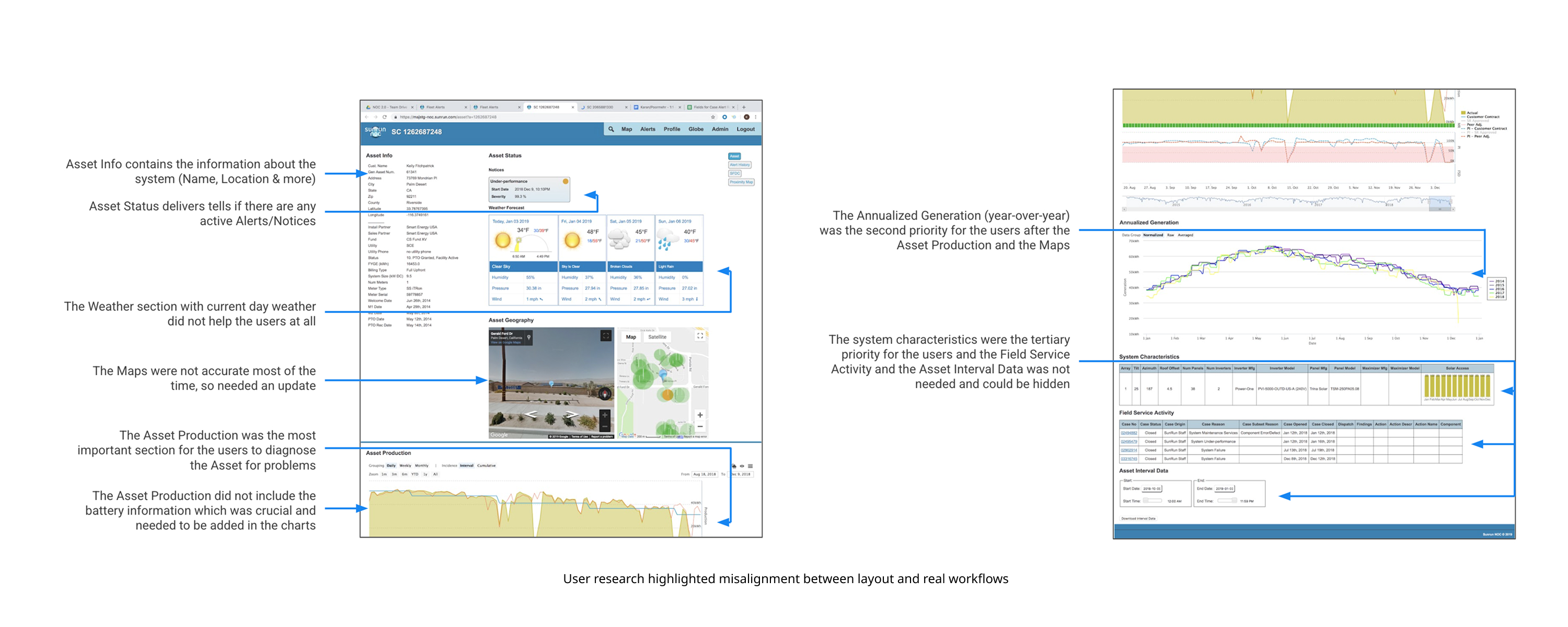
No 4Research & Pain Points
I conducted interviews with Monitoring Analysts to understand how the platform was used daily and where it slowed them down. These conversations revealed clear, repeated pain points tied directly to layout and data prioritization.
Key pain points
• Sections ordered inconsistently with user priorities
• Too much non-critical information surfaced first
• Weak data visualization for pattern recognition
• No native support for battery data
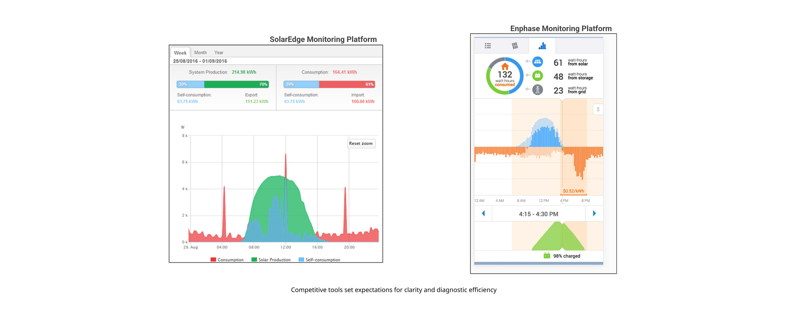
No 5Competitive & Reference Analysis
Benchmarking for Expert Mental Models
Monitoring analysts often spent 30% of their day in third-party tools (like SolarEdge) due to gaps in our legacy internal platform. I benchmarked these tools not just for features, but to understand the visual shorthand analysts were already trained on.
Key Insights Applied:
• Pattern Recognition: Adopted industry-standard color coding for inverter health.
• Signal vs. Noise: Implemented granular toggles to separate production data from environmental sensor data.
• Latency expectations: Designed skeleton loaders and progressive data rendering to match analyst workflow speeds.
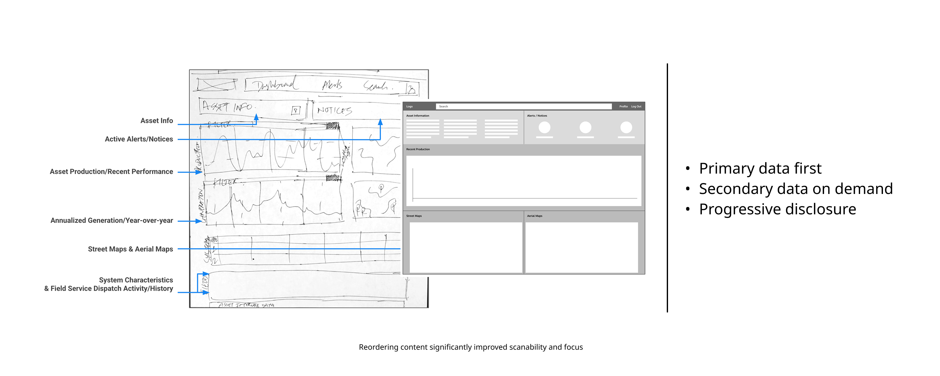
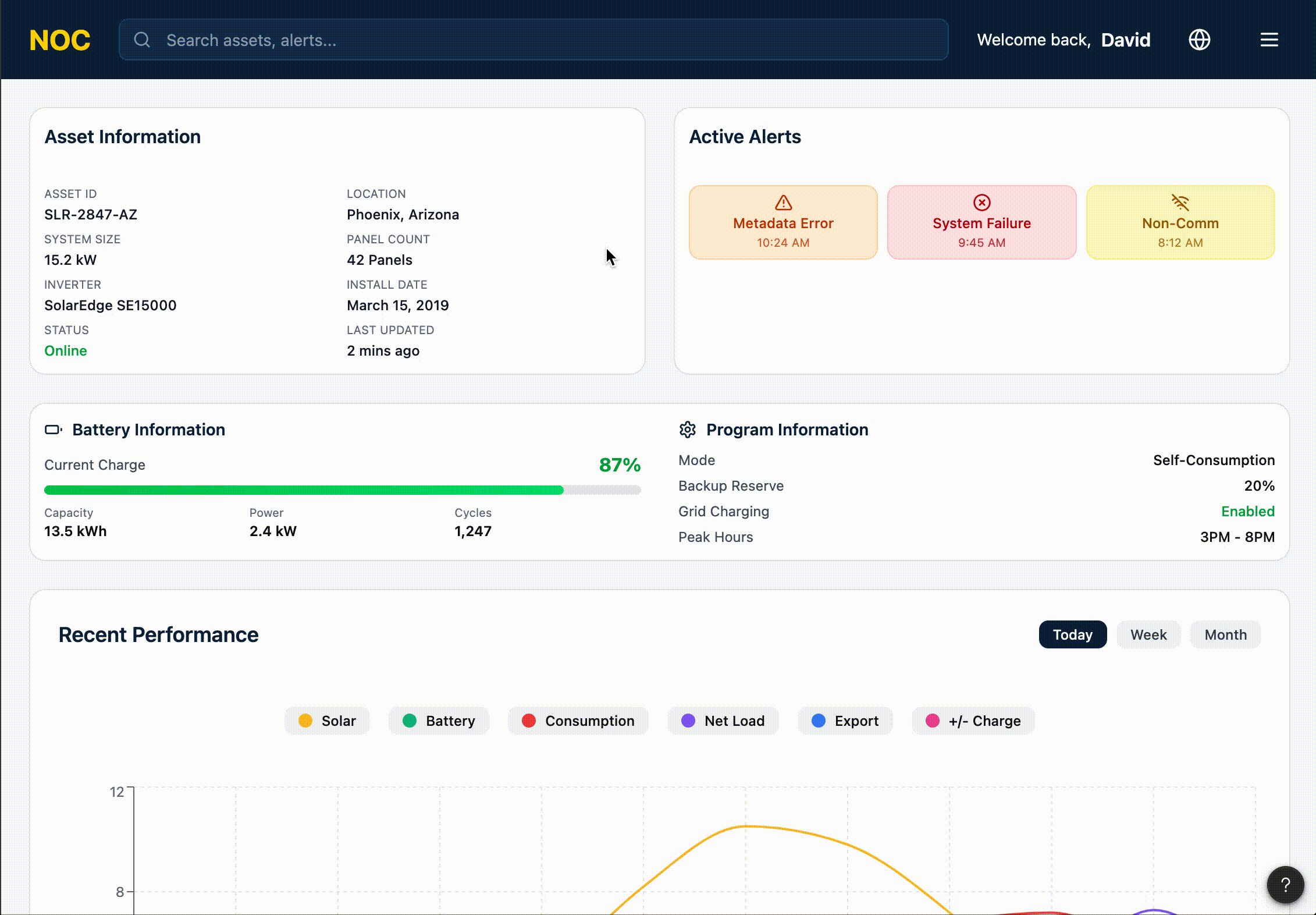
No 6Information Hierarchy Redesign
One of the highest-impact changes was restructuring the platform’s hierarchy so analysts could immediately access the most critical information without losing access to deeper data.
Hierarchy improvements
• Production data prioritized at the top
• Maps and system status surfaced earlier
• Secondary and tertiary data progressively disclosed
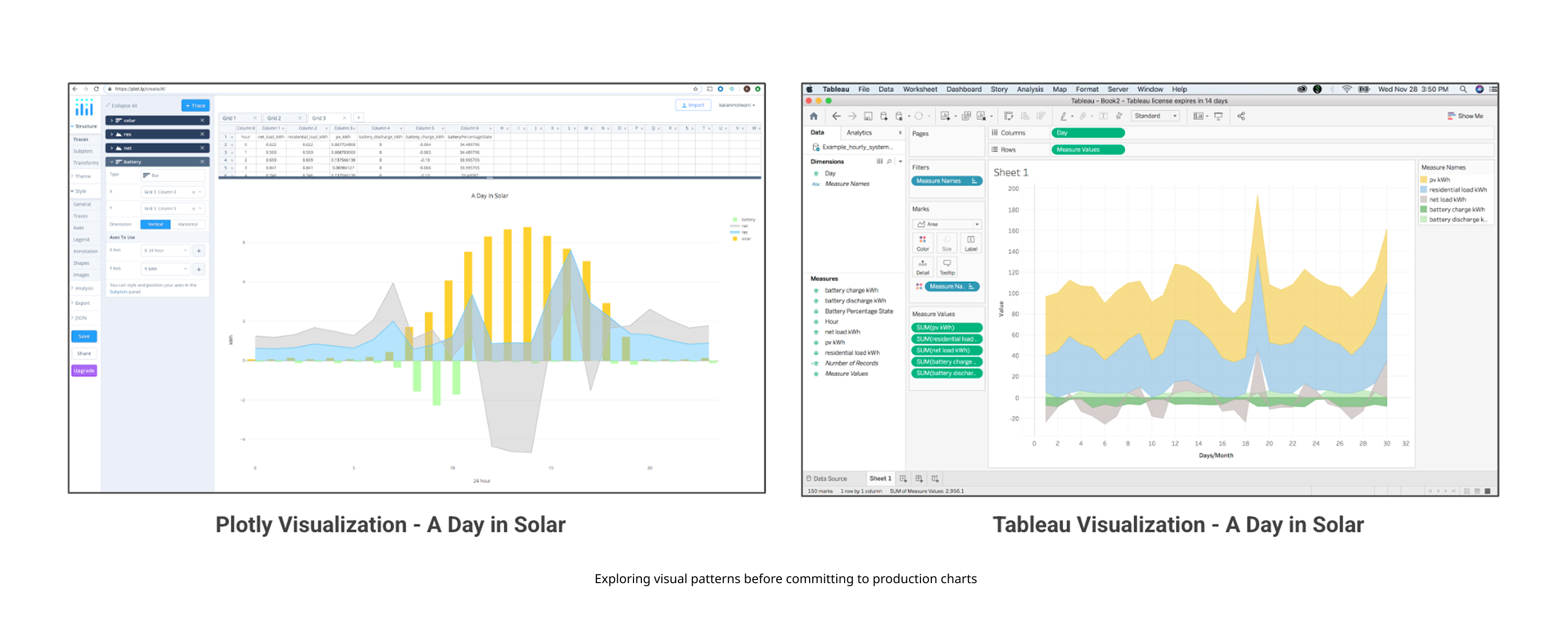
No 7Expanding Data Visualization (Solar → Battery)
The Visualization Challenge: Layering Complexity
Adding battery storage meant introducing 5+ new data streams (State of Charge, Charge/Discharge rates, etc.) on top of existing solar curves. To prevent "Chart Fatigue," I designed a layered visualization system.
• Primary Focus: Default views highlight the correlation between solar production and battery storage levels.
• Synchronized Scrubbing: Hovering over any data point syncs the timeline across all sub-charts for instant temporal context.
• Adaptive Scales: Built auto-scaling axes to ensure small fluctuations in battery voltage remained visible alongside large solar production spikes.
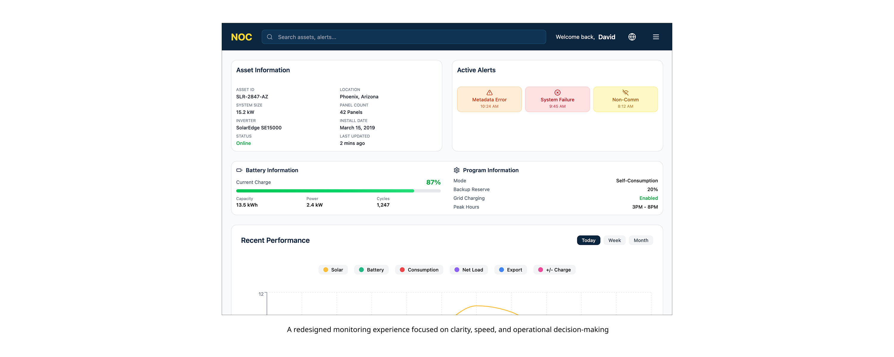
No 8Final Design & User Feedback
The final designs integrated user feedback to further clarify controls, improve chart readability, and reduce diagnosis time. Analysts reported faster issue identification and greater confidence using the platform.
Outcomes
• Reduced diagnosis time
• Clearer solar + battery comparison
• Improved hierarchy and consistency
• Ready for engineering implementation
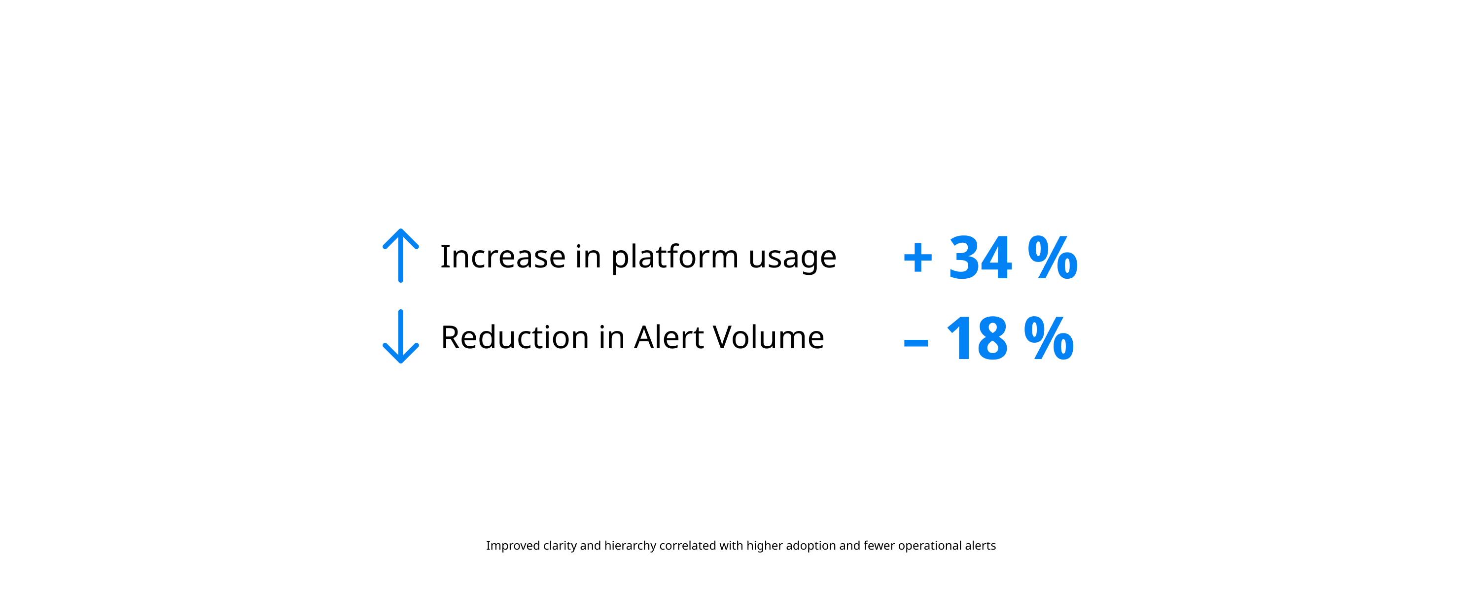
No 9Learnings & Measured Impact
Hard Metrics: Driving Fleet-Scale Efficiency
This redesign moved the needle on Sunrun’s operational costs by making diagnosis faster and more accurate:
• 34% Adoption Increase: Analysts shifted from external tools to the internal platform for end-to-end diagnosis.
• 18% Alert Reduction: Clearer data visualization reduced "false positive" escalations to field engineering.
• Faster Onboarding: Redesigned hierarchy allowed new analysts to become proficient 25% faster than on the legacy Java tool.