Tag It
Customer Facing E-commerce App
No 1Background
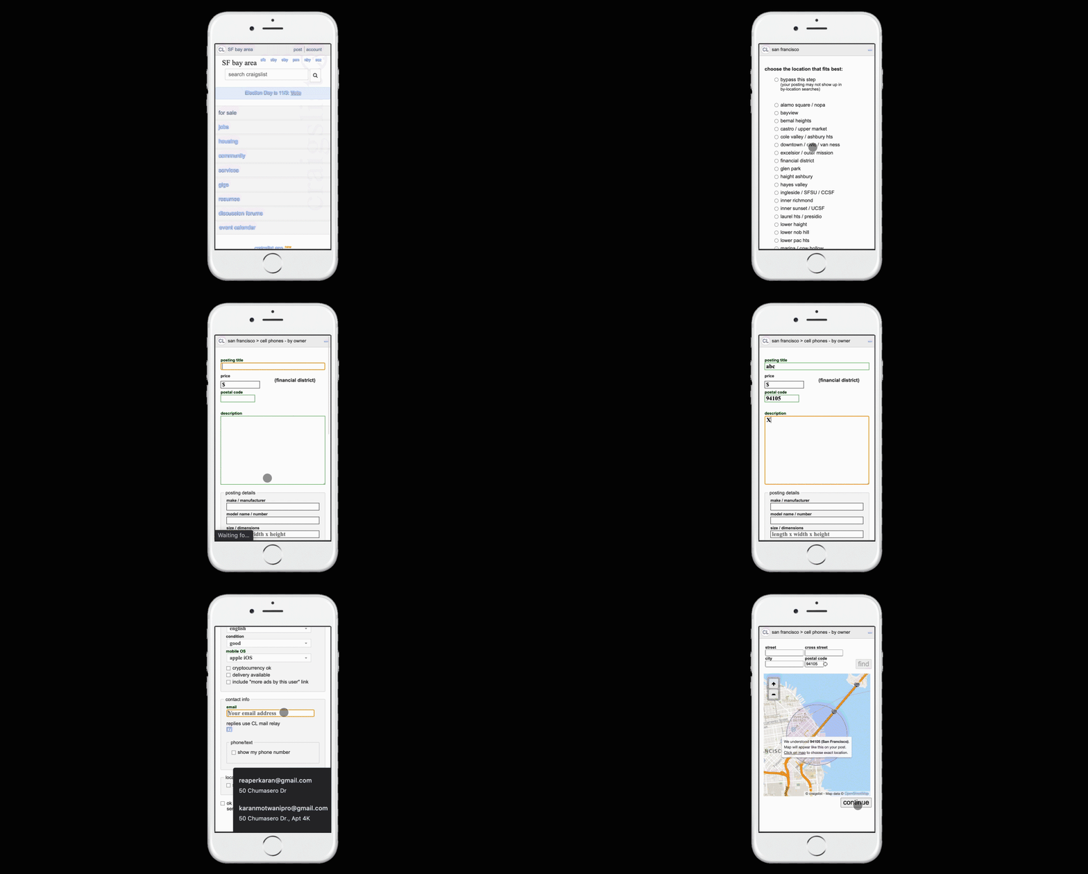
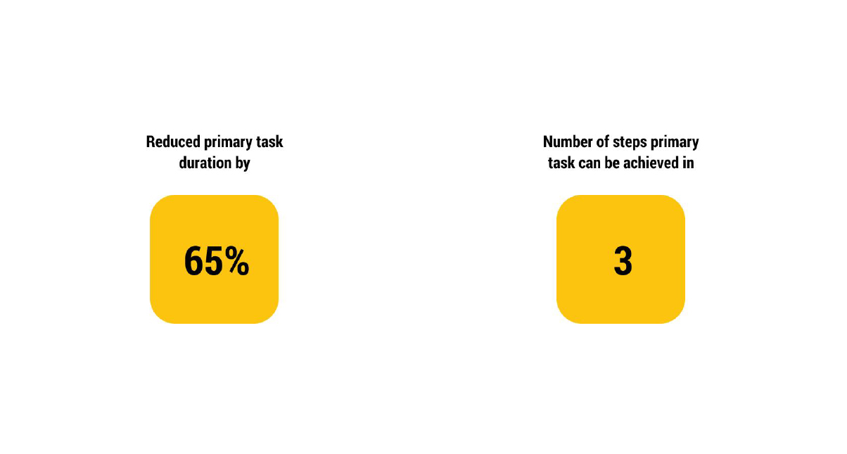
I was moving and wanted to sell things but posting an ad on Craigslist was taking too long because each ad required about 8 to 10 steps to successfully post/publish an ad.
No 2Role
Product Designer
No 3Research
I started with analysing the user flow of Craigslist to post a simple ad. The CTA on the homepage was not clear with no auto-detect for location and was overall very long.
No 4Challenge
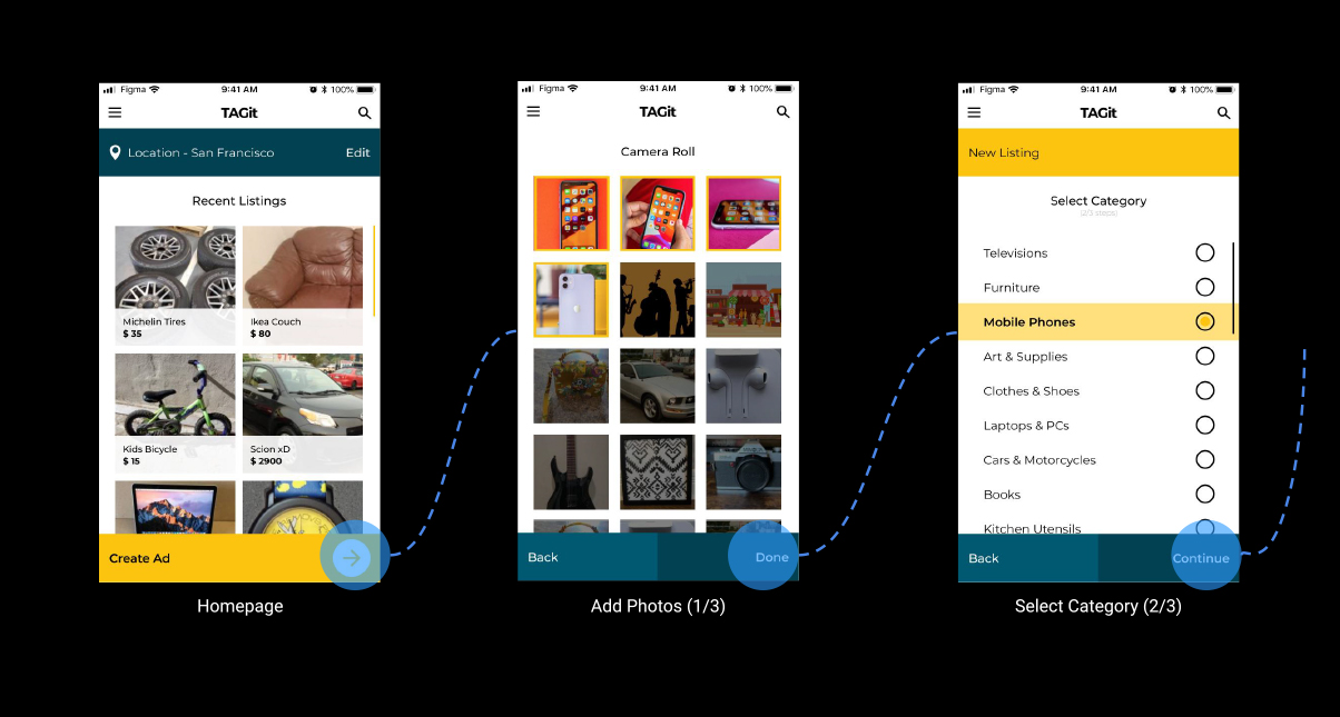
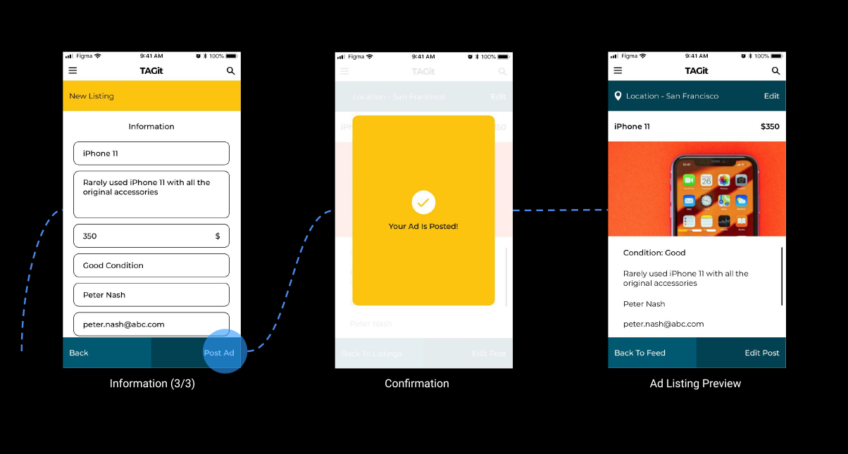
To create a re-selling product app with a better user experience, with clear CTA, to achieve the primary task of posting an ad in as few steps as possible.
No 5User Research
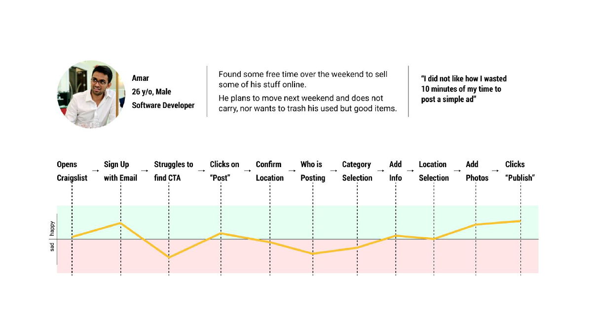
To look at this problem from the user’s perspective, I asked a friend to take me through their experience while I shadow them to observe their pain points.
No 6User's Comments
“I did not like the lengthy process because I spent 10 minutes of my time just to post a simple ad for something I wanted to sell.”
No 7Brainstorming
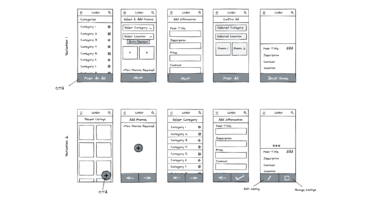
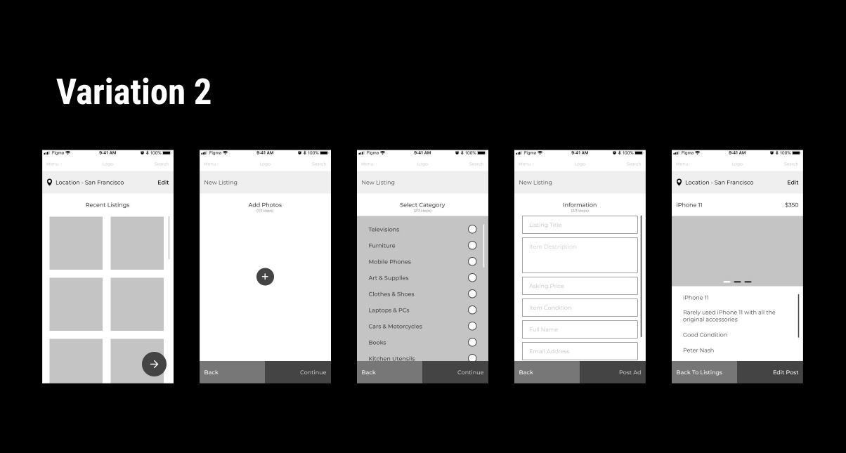
I started with simply sketching the primary user flow variations, one with the existing user flow approach and the other with an updated one.
No 8Wireframes
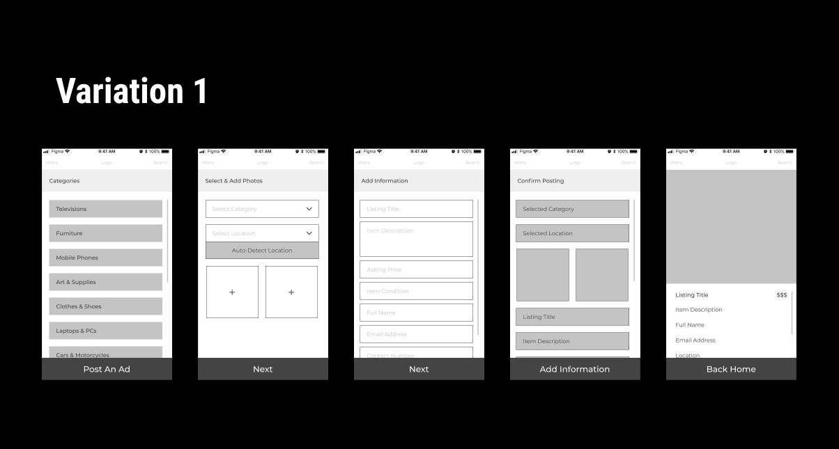
I converted the sketches to wireframes to test them out with the same user for their feedback on what works best for them.
No 9User Feedback
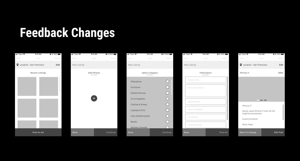
The user liked the second variation better with the recent posts visible on the homepage but preferred the CTA to be clear on home screen like the first variation.
No 10Visual Design
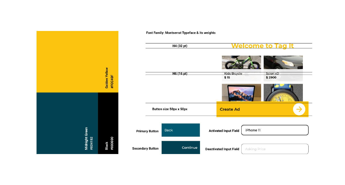
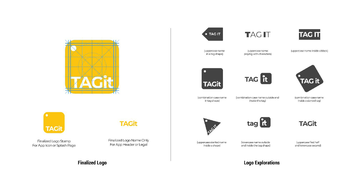
The visuals and UI are the next key things to the success of a product. I focused on keeping it sophisticated and bold.
No 11Final Design
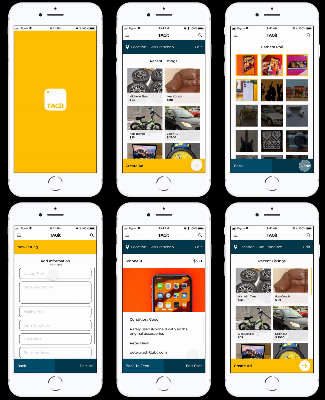
We finished the designs with combining the UX with the UI and visuals, to create a selling app product focused towards user goals.
No 12Learnings
Taking up this challenge of condensing the primary user flow for a better user experience really taught me how to respect user's valuable time and optimization is the way to go.